Online Interactive Graphics & Multimedia
There are many tools that we can use to create interactive online dashboards using a range of free and commercial tools (note that even commercial tools usually have free versions for smaller datasets). These allow us to create and publish interactive maps, charts, animations for use in dashboards or interactive e-documentation.
Flourish is an interactive data visualization product that allows for creating interactive charts, maps, and animation from spreadsheets without requiring any coding or specialized software. The product is used in story map telling that can display up-to-date information.
DataWrapper allows you to create interactive and responsive data visualizations including charts, maps and tables.
Interactive Dashboards
Interactive E-books/Story Maps: It is possible today to create more interactive e-packaging of materials to dramatically change the user experience from reading a hardcopy or static digital documents. This Bhutan Data and Analytics e-book is an example of e-packaging into an interactive document where the user can access a world of knowledge generated from multiple institutions using the evolving interoperability of systems that allows us to embed accessible videos and other multi-media as well as interactive charts, maps, and other datasets into a narrative. It would be useful for most documents and reports (e.g., State of Environment Reports, Stakeholder Assessments, Basin/Watershed Profiles) to become more interactive in the future to allow users to interact and go deeper into any topic as well as benefit from central updating and being able to quickly access the e-packaged resource from any device (e.g., smartphone, tablet, computer).
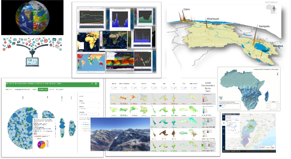
Data & Analytics Dashboards: A special form of e-packaging is to be able to access, analyze, and visualize complex data in a highly interactive manner through customized dashboards. For example, as a companion to this eBook, we have created a Bhutan Data Dashboard to help visualize some examples of a growing world of free, public-domain data and analytic services mostly covering the whole world.
These can include tools to do online analytics that leverage interoperability based on common data standards, open-source approaches, and open data and scripts. For example, in the interactive map below, you can zoom into any area you like (even globally), change background maps that give you scale-dependent services from different institutions using interoperable standards, and if you click on any point (e.g. on a river), it will outline the corresponding watershed (using an ESRI script using the STRM global elevation data that was collected on a space shuttle mission a couple of decades ago) and showing this on an open-source environment (leaflet in this case).
Water Data Apps
There are several apps available online accessible via various devices, from different international organizations working in the water sector that provide access to water data, analytics and monitoring on a global scale, the world bank water data site has a compilationhere.
Below are the links to some global water data and monitoring apps:
- Global Water Security Data
- Women in Water Utilities
- SDG 6 Data Portal
- Aqueduct Water Risk Atlas
- SIASAR Data (An information system about rural water supply and sanitation services in a country)
- IBNET Utility Benchmarking
- Water Risk Filter
- Climate Change Knowledge Portal ( Bhutan Summary , Data )
- Rainfall Shocks and Food Losses
- Global Surface Water Explorer
- GRACE-Follow-On , GRACE Groundwater Subsetting Tool (not very useful for a small country like Bhutan)
- GEOGloWS ECMWF Streamflow Estimation System
- GGMN - Groundwater Monitoring App (inspired by the MARVI App)
- Groundwater GGIS
- Mobile Water Management: For measuring water levels, ground water levels, gate/intake openings and water quality with the click of the button, the Mobile Water Management App allows the automatic computation of flow by clipping a smartphone to a weir stick or taking a picture of a staff gauge upstream of a measurement flume.
- MWater Is an open access customizable application, for monitoring WASH.
- Groundwater Pumping, Monitoring, and Sampling Activity Hazard Analysis (AHA) Mobile App
- The iRain Mobile Appv
- Global Water Security Data
- Women in Water Utilities
- SDG 6 Data Portal
- Aqueduct Water Risk Atlas
- SIASAR Data (An information system about rural water supply and sanitation services in a country)
- IBNET Utility Benchmarking
- Water Risk Filter
- Climate Change Knowledge Portal ( Bhutan Summary , Data )
- Rainfall Shocks and Food Losses
- Global Surface Water Explorer
- GRACE-Follow-On , GRACE Groundwater Subsetting Tool (not very useful for a small country like Bhutan)
- GEOGloWS ECMWF Streamflow Estimation System
- GGMN - Groundwater Monitoring App (inspired by the MARVI App)
- Groundwater GGIS
- Mobile Water Management: For measuring water levels, ground water levels, gate/intake openings and water quality with the click of the button, the Mobile Water Management App allows the automatic computation of flow by clipping a smartphone to a weir stick or taking a picture of a staff gauge upstream of a measurement flume.
- MWater Is an open access customizable application, for monitoring WASH.
- Groundwater Pumping, Monitoring, and Sampling Activity Hazard Analysis (AHA) Mobile App
- The iRain Mobile App